Make a Glass Shield with HTML and CSS
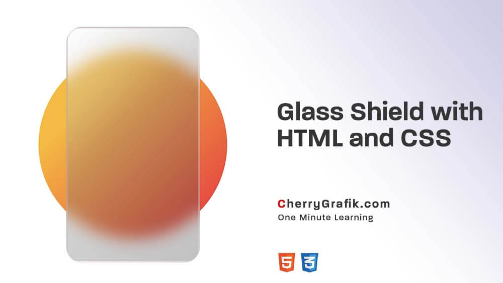
In the next one minute we want to see , how we can make a glass shield card effect also known as “glass morphism” with HTML and CSS.
This effect helps to give a blurred effect to any object you want to put in background of your blurred image as you can see the sample above! Follow along in below steps and check on each and every lines of the script of CSS and HTML provided below for your ease of use and access, and you will have this effect in just one minute.
This effect helps to give a blurred effect to any object you want to put in background of your blurred image as you can see the sample above! Follow along in below steps and check on each and every lines of the script of CSS and HTML provided below for your ease of use and access, and you will have this effect in just one minute.
Steps:
- First, define the classes in the HTML part.
- Set the custom CSS in the “background” class, like width, height and etc.
- Set the custom CSS in the “blurry-card” class, like width, height and etc. In this step note to the important line
– backdrop-filter: blur(10px);
In this line we create our blurry effect. - So in the last step set the custom CSS for our text in the “card-text” class.
HTML Part:
					<div class="background">
    <div class="blurry-card">
        <span class="card-text">CHERRY GRAFIK</span>
    </div>
</div>
CSS Part:
					.background{
    width: 240px;
    height: 240px;
    background-color: #00b712;
    background-image: linear-gradient(315deg, #f50537 0%, #fdb813 74%);
    border-radius: 100%;
    display: flex;
    align-items: center;
    justify-content: end;
    margin: 70px auto;
}

.blurry-card {
    background: #fff;
    width: 170px;
    height: 300px;
    border-radius: 20px;
    margin: auto;
    position: relative;
    top: -30px;
    transform: rotate(-20deg);
    background: rgb(100 100 100 / 40%);
    background: linear-gradient(135deg, rgba(255, 255, 255, 0.3) 0%, rgb(120 120 120 / 30%) 42%, rgb(50 50 50 / 30%) 100%);
    backdrop-filter: blur(10px);
    border: 2px solid rgb(222 200 200 / 40%);
}

.card-text {
  font-family: "Ubuntu", Sans-serif;
    position: absolute;
    font-weight: 600;
    font-size: 15px;
    top: 30%;
    padding: 0 10px;
    color: #ec1c2482;
    letter-spacing: 2px;
}
Result:
CHERRY GRAFIK
